Your home’s circulation spaces do more than just connect rooms. A foyer is where guests pause to drop their coats or park briefcases. Hallways are the routes between rooms. Landings are where you stop to catch your breath. Mudrooms, laundry rooms, and attics often get overlooked, but they play critical roles. With a little creativity, you can make these areas charming and functional rather than just transit zones.
Зміст
Defining the Foyer Entrance
Sometimes referred to as a vestibule or entrance hall, your foyer should be a preview of what’s ahead in terms of color and style. If the rest of your house leans formal, a chandelier serves as an immediate inkling of the gracious living room that follows. If you’re more casual, skip the crystal and opt for black iron fixtures instead.
Color choices matter significantly here. Light neutral colors expand small foyers visually. Uplifting colors like lemon-yellow or orange make the space cheerful. Rich dark shades such as burgundy or chocolate lend an elegant tone. This is your first impression. Make it count.
Utilizing Hallway Space Efficiently
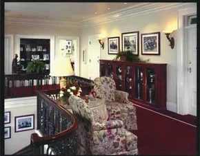
Hallways can be difficult to decorate because they are narrow and often lack purpose. The most common solution for breathing life into a hall is to treat it as a gallery. Hang prints, photographs, or botanical drawings in a uniform fashion. For cohesion, keep framing treatments similar: use black frames throughout or stick to gold.
If the hallway has a jig or awkward shape, try mounting a small shelf with brackets. Slide a stool underneath to create an intimate place to pen a note or make a call without impinging on floor space. For a library touch, install wall-to-ceiling shelves. An 8-inch depth accommodates most volumes.
Lighting is another factor. If neither windows nor skylights are feasible, install adequate artificial lighting. Use color to generate a feeling of light. Pale halls can sometimes look drab. Jewel tones and rich designer-like colors—crimson, deep peach, sun-baked terra-cotta—spell instant glamor. A hall or stair landing with a window and a window seat is often everyone’s favorite spot.
Creating a Functional Mudroom
Stop clutter before it gets into your home by designing a mudroom tailored to your family’s specific needs. Floor and wall treatments here need to be long-wearing. Consider alkyd paints and scrubbable wall-coverings. Use materials like stone, vinyl, and linoleum for the floor.
To organize the paraphernalia that collects in a mudroom, look to plastic bins in wild colors, baskets, or something unpredictable like canvas bags. Generous built-in cubbies will also keep things neat and visible. Stencil a family member’s name above each slot or have the bags monogrammed.
A portable gardening bench stationed in the corner affords a green-thumbed gardener a place to pot bulbs or arrange flowers. A deep laundry sink makes washing a large pot or pet less of a chore. Like any other room, a mudroom gains personality when you add window treatments and art.
Maximizing Laundry Room Utility
Think washing, drying, sorting, folding, and ironing is merely a chore? It doesn’t have to be in the right environment. Laundry rooms welcome pretty papers and bright paint. Stepping out of their drudge roles, the best ones boast cabinetry and counters for folding and stacking.
Clever extras make these spaces multifunctional. Built-in ironing boards and fold-down sewing tables are excellent additions. If possible, plug in a window for natural light and give it a tailored shade or a pert curtain.
Converting Attic Space
With skylights or dormers to let in light and air, a lowly attic is transformed. Rather than battle with quirky angled ceilings, use them to forge unique, personality-filled rooms. Station shorter furnishings to take advantage of the tight space under the eaves. Move larger pieces like beds or sofas toward the room’s middle.
Flooring and Furniture Choices
Before you begin any project, consider the floor. Marble, tile, or slate? If it’s a small entry, splurge on the floor. For a larger area, whether the mood is dressy or relaxed, black-and-white vinyl squares have a timeless appeal. Paint is another alternative. How about a stenciled or trompe l’oeil design? To protect wall-to-wall carpeting, lay down a colorful kilim or rag rug.
A roomy closet is invaluable. But an entryway bench that provides a place to sit is also a utilitarian addition. Look for one with a lid that lifts for storing boots and hooks for hanging coats. A bench painted snowy white with a tall beadboard-paneled back fits a clean-lined country home.
For a period look, antique Victorian hat stands with hooks and a mirror often turn up at antique shops and auctions. Mirrors increase the sense of light. They allow people to adjust their caps or hair as they enter and exit. Is there room for an armoire? Fitted with hooks and a shelf, armoires catch everything from jackets to golf clubs. A stand made of iron, wood, or metal or a large ceramic pot for umbrellas and walking sticks is picturesque and handy.
This is just the start. There are many more ways to optimize these underused zones. The key is to look at each square foot not as wasted space, but as an opportunity for function.
Attics are basically begging for built-ins. If you want that cozy, library vibe, line the walls with bookshelves. Modern homeowners might prefer light-toned cabinetry instead. Either way, you’re using every inch.
Folding screens work wonders if your attic is long and narrow. Place one across an end. It visually shortens the room. A wall of shelves does the same job. You have freedom up here. The rules are loose.
Hallway and Entranceway Makeover
Next up is the hallway. These spaces get ignored. They are often just a tunnel between rooms. We will tackle the entranceway and mudroom too. But the hallway comes first.
The goal is to spruce up under-appreciated areas. You don’t need to spend a fortune. Simple updates work. Think about lighting. Add a mirror. Use paint to open up the space.
Get ready for decorating ideas. The next section breaks down exactly how to handle these overlooked zones. You might be surprised by what a few tweaks can do.
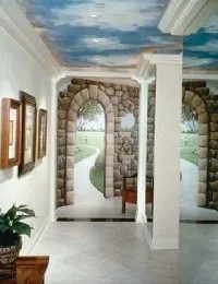
Awkward hallways are the architectural nightmares of most homes. They are often dark, painfully narrow, or absurdly long. Sometimes they suffer from all three flaws at once.
Decorative paint is the solution. Specifically, techniques like trompe l’oeil can completely rewrite the rules of perspective.
The term translates roughly from French as “trick the eye.” It describes the art of creating a three-dimensional illusion on a flat surface.
“Trompe l’oeil means ‘trick the eye,’ and that’s just what an artist does when a three-dimensional space on a flat surface is created.”
Imagine a hallway that once felt like a closet. Now picture a ceiling painted with sweeping clouds. A stone archway appears where there is only drywall.
The effect opens up a cramped interior. Green grass stretches into a fake distance. Blue sky takes up the ceiling space.
Light and color replace the gloom. You might forget you are indoors. The illusion invites daydreams of summer walks instead of dread about walking to the bathroom.
Budget-Friendly Alternatives
Hiring a professional muralist is expensive.
If that price tag is too steep, try these steps:
- Find an art student. They often need portfolio pieces and charge less than established artists.
- Use pictorial wall-coverings. High-quality wallpapers can mimic the look of a painted scene.
- Focus on the ceiling. It is the easiest surface to transform without touching walls.
Making the Entryway Inviting
Your entranceway is another overlooked area.
It sets the tone for the rest of the house.
Read the next section for ideas on grand entranceways.
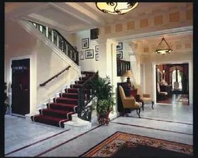
Homeowners often walk past entries and hallways without a second thought. These are transit zones, not living spaces. That’s a mistake. You are wasting valuable square footage that could serve a purpose. The fix is simple: define the mood.
Decide if the space should feel formal or relaxed. The architecture should guide you, but the intent comes from you. For a cozy, low-stakes vibe, drop in a library table. Add a lamp that casts a soft glow. Toss in a comfortable chair or two. It becomes a pitstop for the daily mail or a quiet moment before the chaos starts.
Want something social? Place a pair of inviting armchairs with a round table between them. It’s an instant conversation spot. Or tea station.
“Once in place and in use, you’ll wonder how you did without these surprise settings before.”
Rugs set the stage. Pick cushy ones for the floor. Do not ignore the stairs. Stair runners tie the whole look together and add traction. They lay the foundation for your color palette. From there, you can layer in accessories. Light fixtures. Green plants. The details matter.
Storage is where people mess up. Open shelves look great in magazines but collect dust in real life. If you have family memorabilia, put it behind glass. Bookshelves with glass doors keep the clutter visible but protected. It’s a small change that makes a huge difference in maintenance.
Then there is the ceiling. Skylights. They don’t just add light. They bring in air. They transform a stuffy corridor into something breathable. If your home has them, lean into it. Learn how to make the most of those spaces.
Skylights and Eaves
Eaves are often just an afterthought in renovation plans. They are structural, sure. But they also frame the light coming through the skylight. Without proper eave design, a skylight can turn a hallway into a greenhouse in July and a freezer in January.
Check the insulation around the skylight first. Condensation is the enemy here. If you see moisture, fix it before adding decor. The eaves need to be sealed properly to prevent drafts from messing with your new cozy nook.
When positioning furniture near a skylight, consider the sun path. You don’t want your new armchairs baking at 2 PM. Angle them for indirect light. The natural glow is better for reading than harsh overhead bulbs, but it requires a bit of planning.
Materials matter here too. Wood floors near skylights can fade. Choose stain-resistant finishes or use area rugs to protect high-traffic zones. It’s not just about looks. It’s about preserving the space.
Think about the airflow. If the skylights have vents, keep them clear. Stagnant air ruins the vibe faster than bad lighting. A simple cross-breeze makes a hallway feel larger and fresher. It’s a low-effort upgrade with high reward.
You’re turning a pass-through into a place you actually want to be. The shift is subtle. It’s in the lighting. The seating. The lack of dust-collecting shelves. But when you walk through, you notice it.
Does your entryway feel like a hallway or a destination? The difference is usually in the details you’ve been
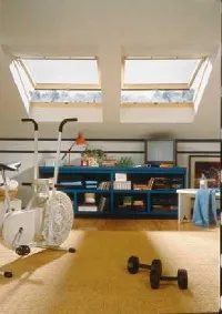
Stop pretending your personal space isn’t a priority. Too many homeowners settle for what’s available instead of fighting for what they actually need. These two owners didn’t wait. They took a look at the cramped, dusty attic above their heads and saw potential. Not storage for old holiday decorations. Not a place for the lawnmower to rot. They saw a sanctuary.
She wanted a dedicated office. Specifically, one with a large drawing board. She needed room to spread out her designs, to trace, to plan. The standard desk in the corner of a bedroom just doesn’t cut it for serious work.
He wanted a gym. Just a few hours a day to sweat, stretch, and get his heart rate up before or after the workday. He didn’t have the square footage for a full setup downstairs. Or the budget for a sprawling addition.
They both got their wish. The trick? They ignored the idea of expanding outward. Adding a room costs a fortune. It requires permits, contractors, and months of disruption. Instead, they looked up.
Why Unused Attic Space Is Your Best ROI
Forlorn attics are everywhere in older homes. They’re often dark, cluttered, and structurally sound but emotionally dead. Transforming them is one of the highest-return DIY projects you can undertake. It doesn’t matter if your house is modest in size. A finished attic makes a small home feel grand. It adds usable square footage without changing the footprint.
The architect and the fitness enthusiast both leveraged this. They didn’t need to tear down walls. They needed to make the vertical space livable. And the key to that is light and air.
Skylights Without the Dormer Cost
Constructing dormers is expensive. It involves complex roofing work, structural framing, and often a significant increase in roof pitch. It’s a major construction project.
Skylights are different. They are the lightweight alternative. You can install them without the heavy lifting of building out the roofline. They let in natural light. They provide ventilation if you choose operable units. They make a cramped attic feel open, airy, and connected to the outdoors.
If you haven’t explored transforming that unused attic space, stop waiting. The expense of dormers is unnecessary for many applications. A well-placed skylight solves the darkness problem instantly.
What Can You Do With Finished Attic Space?
Once the structure is sound and the light is in, the possibilities expand. It’s not just about an office or a gym. Think about the privacy an upper-level room offers.
A guest room that feels like a retreat. A teen’s private hideaway where they can escape the noise of the main floor. A quiet sitting spot for you and your spouse to read or drink coffee in silence. These are the kinds of rooms that add value to your daily life.
The transformation requires finished walls and new floors. That’s it. Remove the insulation if it’s wet or moldy. Install new insulation. Hang drywall. Lay down flooring that can handle foot traffic. The dilapidated attic becomes a destination.
“With new finished walls and floors, previously dilapidated attics can give even a small house grand possibilities.”
Moving from Vertical to Horizontal: The Entranceway
The attic is about reclaiming wasted vertical
Feng shui principles suggest your entryway sets the energetic tone for the entire house. It needs to be a high-traffic zone that feels inviting rather than oppressive. Clutter kills flow. Brightness restores it.
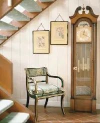
Look at this California home. The entry sits on the ground floor. It uses a tiled floor because wet shoes track in water. Tile handles that mess. Light walls pull people inside. Floating stairs lead up to the main living areas. Living room. Dining room. Kitchen. Master suite. All above.
This is a prime spot for personal history. Not just storage. Display. A grandfather clock anchors the corner. It marks time and space. An impressive commode offers storage for winter gear. Mittens. Hats. Extra sweaters. Keep it practical.
Hallways don’t have to be boring gray tunnels. Use this formal portal as inspiration. Add collectibles. Hang art. Try faux painting if you’re feeling bold. Make it yours.
Designing a Functional Mudroom
Every home needs a mudroom. Ideally one that looks good while holding the mess. Rain or shine, durability matters. Stone floors. Tile. Vinyl. These materials survive the wear and tear of daily life.
This specific mudroom leans into charm. The beamed ceiling has an antique feel. It adds character. Open shelves line the walls. They hold jars of homemade preserves. Canned veggies from the garden. It feels welcoming.
Hanging dried herbs and flowers add texture. Baskets provide extra storage. It feels like a country kitchen come to life.
Kids move through quickly. They drop baseball bats. Hockey sticks. Shoes go by the door. Then they’re gone. But the sink is always there. Need to wash muddy hands? It’s there. Need to water flowers? Or shell peas while cooking? The sun-swept sink is ready for domestic tasks too.
Maximizing Attic Living Space
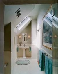
That sprawling 1920s home had a secret. For decades, the attic sat there, heavy with dust and missed opportunity. It was just storage for old boxes and seasonal clutter. Then came the renovation that changed everything. The architects saw what others missed. They saw light. They saw space. They saw a sanctuary.
Now, where there was once shadow and silence, there is a spectacular, private master suite. It isn’t just a bedroom. It is a full retreat. The owners have a living area for entertainment, a bedroom for rest, and a bath for luxury. It feels worlds away from the rest of the house.
Maximizing Light and Space in Small Areas
The key to unlocking an attic’s potential is light. The old space was dark, gloomy, and压抑 (oppressive). To fix this, a series of new skylights were installed. They pull in natural sun during the day and flood the rooms with brightness. This simple change shifts the energy of the entire floor. It turns a cave into a sky-lit chamber.
To keep that airy, up-and-away feeling alive, the design relies on restraint. The walls are painted a crisp, clean white. Nothing else competes for attention. Furnishings are minimal. If you don’t need it, leave it out. Clutter kills the sense of height in a slanted roof.
“To maximize the fresh, airy, up-and-away feeling, the walls are painted a crisp white and furnishings are minimal.”
Flooring matters too. A pale, wall-to-wall carpet was chosen for a reason. It ties the room together visually. More importantly, it muffles noise. Attics can echo. Steps creak. Wind whistles. Thick carpet absorbs sound, creating a quiet cocoon. It also adds softness underfoot.
Storage is the unsung hero of small spaces. You cannot afford loose items. The design includes plentiful built-in storage. Cabinets, shelves, and hidden compartments keep things orderly. A tidy room feels larger than it is. A messy one feels cramped, no matter how big it is.
Why You Should Claim Unused Square Footage
An attic, basement, or garage often sits idle. That is wasted money. That is wasted comfort. An architect or a space-planner can help you stake claim to these forgotten zones. They know how to navigate sloping ceilings and low headrooms. They know where to place windows for maximum impact.
Call in an expert. Watch the possibilities unfold. You might not need a full master suite. But you can add a home office, a guest room, or a studio. The process starts with a vision. It ends with a functional, beautiful room.
Creating an Exciting Hallway
The vibe you create in private spaces sets the tone for the whole house. Your master suite is a sanctuary. But the hallway leading to it? That is the welcome mat. It is the first impression. Continue on to the next section to learn ways to create an exciting hallway.
Hallway Design Principles
Hallways are often afterthoughts. Dark corridors. Narrow passages. They get traffic but no love. That changes when you treat them as part of the journey. Lighting plays a huge role here. Wall sconces or track lighting can stretch a narrow space. Mirrors can double the visual depth
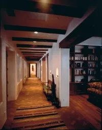
Think about your daily routing. Up and down. Back and forth. It’s a chore disguised as movement. Why settle for a sterile transit zone when you can make the journey itself delightful?
Take a cue from Southwestern design. That style doesn’t just look good—it feels like an escape. Think stucco walls that soften edges. Ceilings beamed with rough-hewn timber. Floors laid with brick that invites bare feet. It’s the Yellow Brick Road, minus the Dorothy.
Lighting and Texture in Narrow Spaces
Hallways suffer from a specific kind of visual claustrophobia. They are narrow. They are often dark. But light changes everything.
During the day, natural light floods in. Creamy stucco reflects it back, keeping the air feeling open rather than cramped. The brick floor ties it all together. It adds warmth without overwhelming the senses.
Nightfall is different. Candles change the game entirely. The red bricks absorb the glow and radiate it back. Suddenly, the corridor isn’t a passageway. It’s a mood.
Strategic Seating and Views
Bright woven rugs break up the monotony. They mark the path. But don’t stop there.
Create niches. Tuck away candles for a romantic flicker. Install overhead lights for practicality. Use windows and French doors to frame the outside world.
Find that one window with the best view. Put a bench in front of it.
This isn’t just furniture. It’s an invitation to pause. To sit. To breathe.
If you have a spare moment in your hall, consider a stool. Or a small rocker. A builder can even cut a new window into a gloomy stretch of wall. Transform the dark into a place you want to linger.
Shifting Focus: The Laundry Room
Getting from point A to point B in style is great. But what about the rooms you have to use? The ones with pure, unglamorous function?
They don’t have to be boring.
Next, we tackle the laundry room. It’s time to make the mundane manageable.
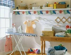
Gone are the days when your laundry room was a depressing basement corner or a windowless closet that smelled faintly of mildew. The modern approach treats this space as a functional hub, not a punishment. You can design a room that actually feels good to spend time in.
Current trends favor light-colored walls to bounce what little natural light exists. Pair those walls with cheerful wall coverings—think wallpaper or a fresh coat of bright paint. For floors, choose materials that can take a beating. Long-wearing wood is a top choice for these rooms. It looks good and survives the occasional spill or dropped bottle of detergent.
You need surface area. Sorting and folding require a flat plane. Build in a table or a counter. If you can fit an ironing station into the layout, do it. It saves time later.
Decorating shouldn’t stop at functionality. Give the room a face. Use baskets or glass jars to corral supplies off the counters. A single plant adds life. Hang a curtain that fits the window’s character.
“Make the most of auxiliary spaces like your entranceway, hallways, mudroom, and attic.”
This logic applies beyond just the laundry room. Treat your mudroom with the same practical eye. Your entranceway sets the tone. Hallways can hold storage solutions. The attic needs organization. These are all opportunities to reduce clutter elsewhere in your home.
The goal is simple. Make the spaces you use every day work for you. Start with the laundry room. Pick a floor that holds up. Add a counter. Fill it with jars. It doesn’t have to be perfect. It just has to work.