Light color sets the tone. It defines the mood, purpose, and feel of a room. Get it wrong and your space feels cold, clinical, or just plain off. Get it right and the room breathes.
The key metric is the Kelvin (K) scale. It’s not a measure of brightness. It’s a measure of hue. Low numbers mean warm, cozy light. High numbers mean cool, stark light.
Зміст
1. Warm White Light (2700K–3000K)
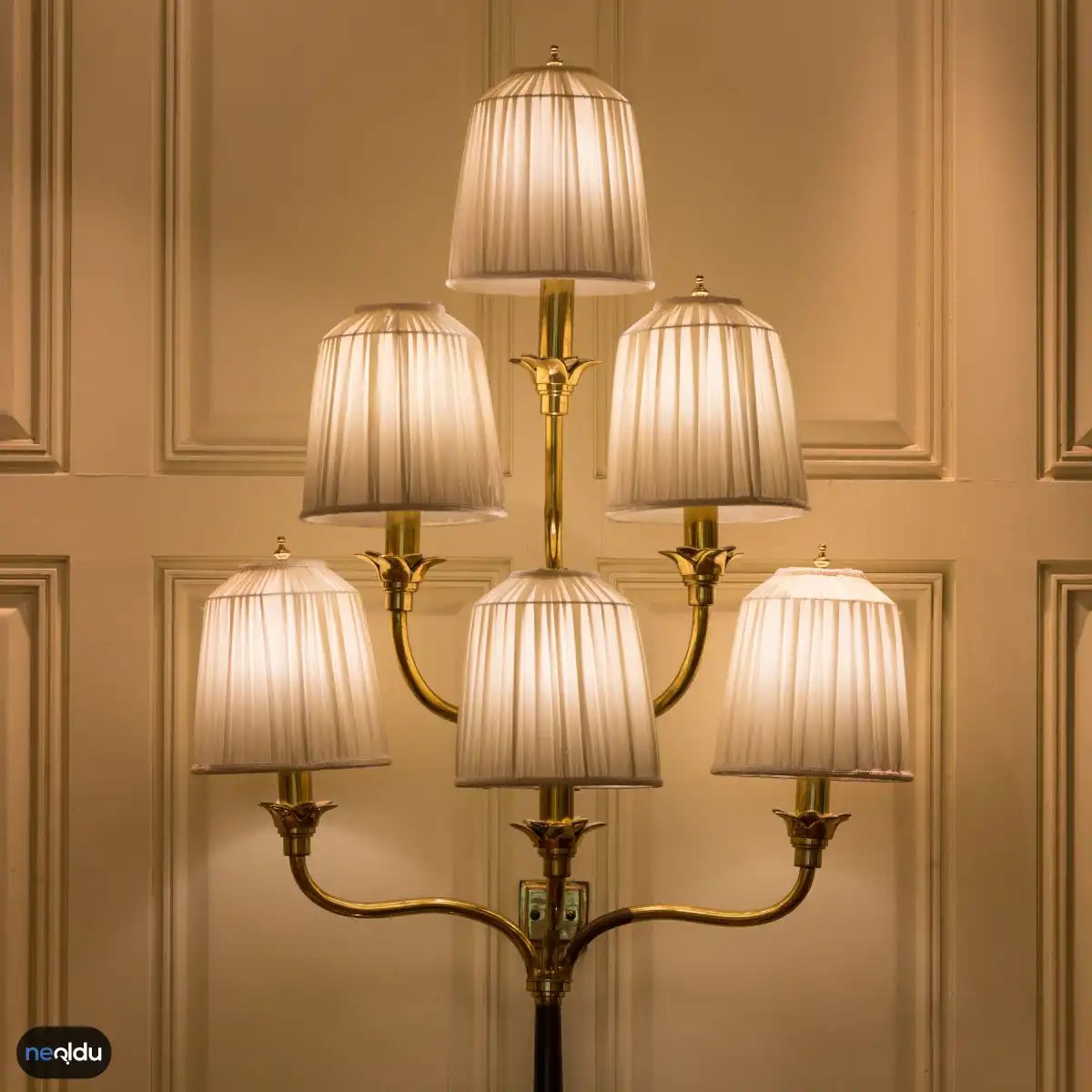
Warm white is the default for most living spaces. Think of it as the lighting equivalent of a sunset or a candle. It sits at the lower end of the Kelvin spectrum, typically ranging from 2700K to 3000K.
Why does this matter? Because your brain associates this range with relaxation. It suppresses blue-light exposure that keeps you awake. That’s why you rarely see this tone in offices or hospitals. You see it in bedrooms, dining rooms, and living areas.
The technical side is simple. Bulbs labeled “Soft White” or “Warm White” on the packaging fall here. When shopping, check the box. If it says 2700K, you are looking at a golden, yellowish hue. This is not daylight. Daylight is blue-white. This is amber.
Using this tone incorrectly can make a room feel dingy. Too much warm light in a workspace kills productivity. The eyes strain. But in a living room? It softens edges. It makes textures pop. Wood grain looks richer. Fabric feels softer.
The catch? Color rendering. Some cheap warm-white LEDs distort reds and greens. They make food look slightly gray. Invest in a bulb with a higher CRI (Color Rendering Index) if you care about how your dinner looks.
2. Cool White and Daylight (4000K–6500K)
Flip the scale. Move up to 4000K and you hit “Cool White.” It’s neutral. Not yellow. Not blue. Just clean white. This is where offices thrive. It mimics the mid-morning sun. It keeps you alert.
Go higher. 5000K to 6500K is “Daylight.” It’s blue-white. Stark. It reveals every flaw in your paint job. It’s perfect for garages, workshops, and task lighting over a kitchen counter. You need visibility here. You need to see the crack in the tile. You need to see the grain of the wood when you are sanding.
But don’t put 6500K bulbs in your bedroom. Ever. Your circadian rhythm will hate you. You will lie there staring at the ceiling, feeling wired and anxious. The blue light tricks your brain into thinking it’s noon.
3. The Grey Area: Neutral White (3500K)
There is a middle ground. 3500K. It’s less yellow than warm white. Less blue than daylight. It’s a clean, modern look. Popular in minimalist designs and bathrooms. It gives you enough contrast to shave without squinting, but not so much blue that it disrupts sleep if you stay up late.
How to Pick
2. Soğuk Beyaz Işık Tonu
Karşısında duran şey bu kadar rahatlatıcıysa, öbür uçtaki seçenek adeta bir uyarıcı gibi çalışır. Soğuk beyaz ışık, renk sıcaklığı 4000K ile 5000K arasında değişir.
Gözünüzün önüne getirmesi kolay bir benzetme var: gün ışığı. Tam da bu yüzden bu ton, odaklanmayı gerektiren her şey için tercih edilir.
Mutfak tezgahında yemek hazırlarken, garsonun tabağı kontrol ettiği gibi keskin ve net olmalısınız. Soğuk beyaz, gölgeleri minimize eder. Yanlışlıkla bir malzeme almayı veya bir hatayı fark etmeyi zorlaştırır.
Nerede Kullanılır?
- Mutfaklar: Yemek pişirme ve temizlik için net görüş imkanı sağlar.
- Ofisler ve Çalışma Alanları: Konsantrasyonu artırır.
- Banyolar: Makyaj yaparken veya tıraş olurken gerçek renkleri daha doğru görmenize yardımcı olur.
- Depolar ve Atölyeler: Detayları ve potansiyel tehlikeleri daha iyi görebilirsiniz.
Avantajları ve Dezavantajları
Avantajları:
– Odaklanma seviyesini artırır.
– Görev odaklı ortamlar için idealdir.
– Temiz ve modern bir görünüm yaratır.
Dezavantajları:
– Uzun süre kalındığında yorucu olabilir.
– Rahatlama ve dinlenme anlarında uygun değildir.
– Soğuk tonlar, bazen mekanın daha küçük ve steril görünmesine neden olur.
Hangi Ampul Seçilmeli?
Soğuk beyaz ışık için LED ampuller en iyi seçenektir. Enerji verimliliği yüksektir ve ömürleri uzundur. Ayrıca, ısı üretimleri az olduğu için yangın riski de düşüktür.
Ampul seçerken, watt değeri kadar lümen değerine de dikkat edin. Daha yüksek lümen, daha parlak bir ışık anlamına gelir. Ancak çok yüksek parlaklık, göz yorgunluğuna neden olabilir.
Güvenlik ve Kurulum
Soğuk beyaz ışık, özellikle yüksek tavanlı alanlarda kullanıldığında dikkat gerektirir. Kurulum sırasında elektrik tesisatına zarar vermemeye özen gösterin.
Evinizde hem sıcak hem de soğuk beyaz ışık kullanmak istiyorsanız, dimmer (karanlık ayarı) özelliği olan ampuller tercih edin. Işık şiddetini ayarlayarak, ortamın ruhunu değiştirebilirsiniz.
Sonuç olarak, soğuk beyaz ışık, fonksiyonel bir seçimdir. Ancak evinizin ruhunu yansıtmak için sadece bu tonu kullanmak yerine, sıcak beyaz ile denge kurmak daha akıllıca olabilir.
3. Günışığı Beyaz Işık Tonu
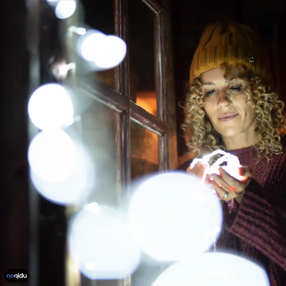
Günışığı beyaz, spektrumun o keskin, net bölümünde yer alıyor. Renk sıcaklığı yaklaşık 5000 Kelvin ile 6500 Kelvin aralığında değişiyor. Bu aralık, gökkuşağının mavi ucuyla tam beyazın arasında konumlanıyor.
Neden bu kadar popüler? Çünkü kontrastı artırıyor. Renkler olduğu gibi, daha doğru bir şekilde görünür.
Evinizde detaylı işler yapıyorsanız, bu ışık tonu bir mucize gibi gelir. Makyaj yapmak, dikiş dikmek veya karmaşık bir boya karışımı hazırlamak… Her şeyin gölgelerini netleştirir. Göz yorgunluğunu azaltır. Odalara daha geniş, daha ferah bir hava katar.
Ofislerde, atölyelerde veya garajlarda sıkça tercih edilmesinin nedeni de bu. Odaklanmayı destekler. Uykulu hissettirmez.
Ancak bir uyarı var. Soğuk beyaza göre daha keskindir. Yatak odası gibi sakinlik aranan alanlarda kullanıldığında, rahatsız edici olabilir. Sabah ışığına en yakın olan bu ton, gece modunda kalmak isteyenler için uygun değil.
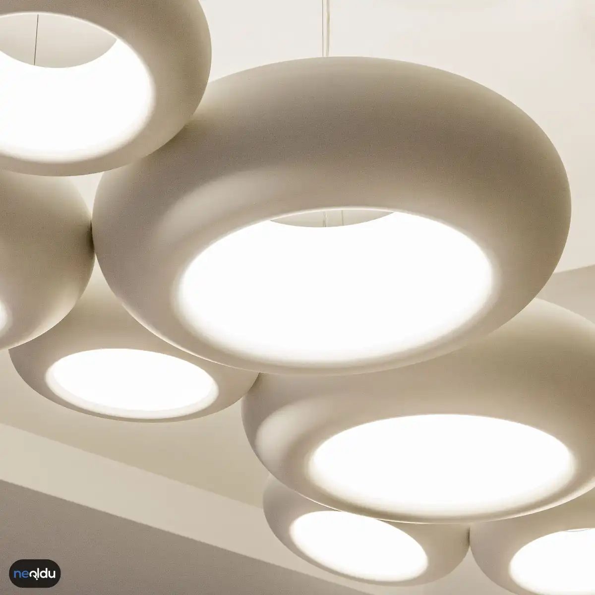
4. Amber Işık Tonu
If daylight white was all business, amber is the opposite. It sits comfortably between 2000K and 3000K on the Kelvin scale. That low number means lots of red and yellow. Very little blue.
This isn’t light for precision work. You won’t find it in a surgeon’s operating room. Instead, this is the glow of a campfire. Or a candle. It’s warm. Intimate.
Why it works where it does
Ambient lighting is the primary use case. Think living rooms. Bedrooms. Dining areas. The goal here isn’t to see every pore on your face. It’s to relax. Amber light signals the body to produce melatonin. It prepares you for sleep. That’s why you rarely see bright blue LEDs in bedroom nightstands. They’re usually soft and amber-tinted.
How it affects materials
Color rendering changes under this spectrum. Reds look richer. Oranges pop. Greens can look muddy. If you’re styling a space with autumnal palettes—burnt siennas, deep browns, terracotta—amber light enhances those tones naturally. It creates depth. Cool white light often flattens these colors. It washes them out.
For homeowners, this matters when choosing fixtures.
- Bedrooms : Amber bulbs promote better sleep hygiene. They mimic sunset.
- Dining rooms : Warmth makes food look more appetizing. Especially meats and roasted vegetables.
- Entryways : A welcoming glow that doesn’t feel sterile.
The trade-off
You lose accuracy. Details become harder to distinguish. Shadows soften. This is great for mood. Terrible for detail work. Don’t install amber LEDs in your workshop. You’ll miss the grain in the wood. You’ll misjudge a cut.
Safety note: Low light levels require caution. If you’re working late in a room lit only by amber LEDs, visibility drops. Use task lighting. Don’t rely on ambient amber for hazardous tasks.
Which light suits your next project? Daylight for the job. Amber for the rest.
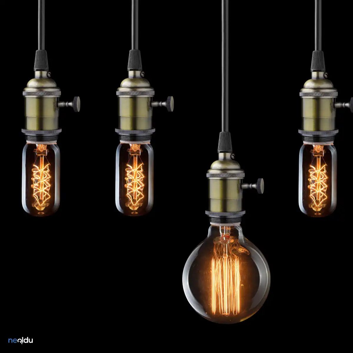
5. The Red Light Tone
You want passion? You want drama? Red light is where you start. It is not subtle. It is direct, intense, and hard to ignore. Most people think of red lights as warning signals or emergency vehicles. They do not think about ambiance. That is a mistake.
This tone sits at the lower end of the visible spectrum. It is close to orange but goes deeper. Think of the glow from a dying ember. Think of a sunset bleeding into night. It creates a heavy, warm atmosphere that feels intimate. Some call it romantic. Others call it intense. It depends on how you use it.
Where to Use It
You do not put red light everywhere. It is too aggressive for a general living room. It can make people feel anxious if the brightness is too high. But in specific zones? It works.
- Dining Areas: Use it sparingly. A dim red bulb over a table can make food look richer. It creates a sense of closeness.
- Private Spaces: Bedrooms or dens benefit from low-level red lighting. It helps the room feel enclosed and safe.
- Accent Walls: Point a focused red light at a textured wall. The shadows deepen. The texture pops. It adds depth without painting the whole room.
How It Affects Perception
Red light is not just about color. It is about temperature. It feels warmer than yellow or white. Your brain interprets this warmth as comfort. But there is a catch.
Red light can distort colors. Look at a white shirt under red light. It looks pink. Look at green vegetables. They look brown. This is not a bug. It is a feature. If you are cooking, avoid red light. The colors of your ingredients will be wrong. You will not know if the meat is done. You will not know if the sauce is too dark.
For dining, this distortion can be intentional. It makes the meal feel like an event. It slows down time. People talk longer. They eat slower. It works.
Choosing the Right Fixtures
You need fixtures that diffuse the light. A bare bulb is too harsh. You want the light to scatter.
- Dimmers are non-negotiable. Red light at 100% brightness is overwhelming. It feels like a club or a nightclub. Dim it down to 20% or 30%. The warmth returns. The intensity fades.
- Wash lights or sconces. Avoid overhead recessed lights. They throw red down on heads. It looks unnatural. Aim for uplighting or wall-washing. It creates a soft glow.
- Material matters. Red light reflects off glossy surfaces differently. It can create hot spots. Use matte finishes on walls and furniture. They absorb the light. They keep the mood consistent.
Safety and Practicality
Red light is generally safe. It does not emit much UV radiation. But the heat output can be high depending on the bulb type. If you use incandescent bulbs, they get hot. Keep them away from curtains or paper. LED red lights run cooler. They are safer for enclosed fixtures.
Also, consider your circadian rhythm. Red light has less impact on melatonin suppression than blue or white light. It is better for evening use. You can keep the lights on later without disrupting
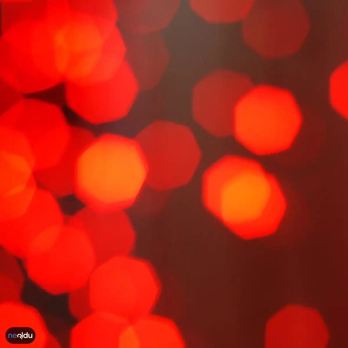
6. Yeşil Işık Tonu
Yeşil ışık tonu kelvin derecesi 3000K ila 4000K arasında yer alır. Göz yormayan bu renk seçeneği, doğallığı ve huzuru temsil eder. Özellikle yaşam alanlarında sakin bir atmosfer yaratmak için tercih edilir.
Bu ton, ofis ortamlarında odaklanmayı artırmak için de kullanılabilir. Ancak aşırı yeşil tonlardan kaçınmak önemlidir. Göz sağlığı için daha dengeli bir seçenek arıyorsanız, bu aralığı incelemek faydalı olabilir.
7. Mavi Işık Tonu
Mavi ışık tonu kelvin derecesi 5000K ila 6500K arasında değişir. Soğuk ve ferah bir his veren bu renk, modern mekanların vazgeçilmezidir. Genellikle banyo, mutfak veya çalışma odaları için idealdir.
Gündüz ışığını taklit etmesi sayesinde uyku düzenini bozabilir. Bu yüzden yatak odalarında kullanırken dikkat etmek gerekir. Özellikle gece saatlerinde mavi ışığa maruz kalmak uyku kalitesini düşürebilir.
8. Beyaz Işık Tonu
Beyaz ışık tonu kelvin derecesi 6500K ve üzerindedir. En soğuk renk kategorisidir. Keskin ve net bir görünüm sağlar. Endüstriyel tasarım veya minimalist evler için sıkça tercih edilir.
Görev odaklı işler için en uygun ışık türüdür. Detayları net görebilmek için beyaz ışık iyi bir seçenek olabilir. Ancak fazla kullanıldığında mekanın soğuk ve yaşanmaz bir havası olabilir.
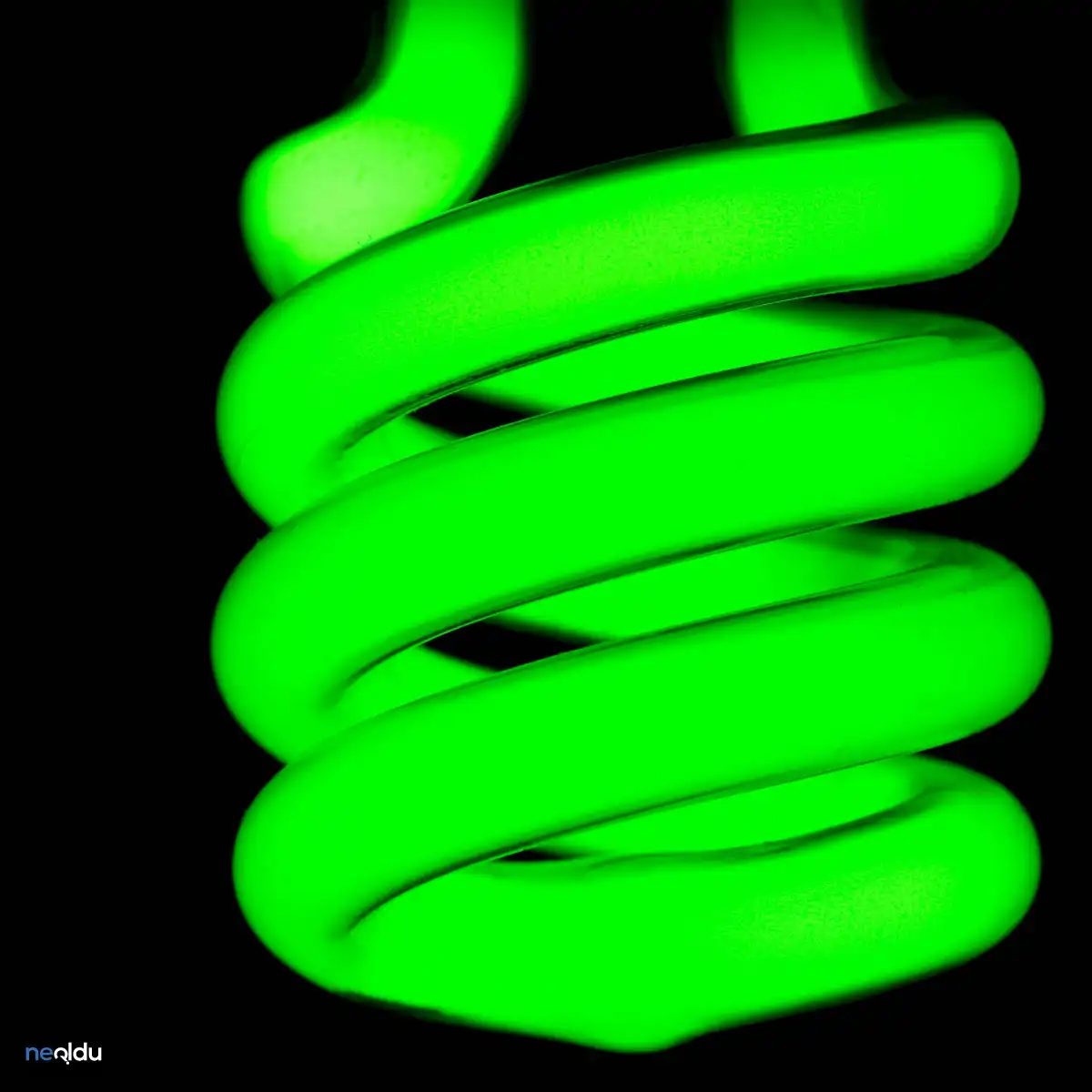
Where does green light fit in your renovation plan?
You won’t find green lighting fixtures at every hardware store. It’s niche. But that niche matters if you’re dealing with specific environments. The color temperature sits between 5000K and 6500K. That’s cool white to daylight territory. But the hue itself? It’s a warmer green. Not neon. Not swampy. Just green.
This combination makes it ideal for two very different spaces. Plant rooms. Yoga studios. Both demand focus. Both demand calm. But for opposite reasons.
Growing plants without the headache
If you’re building an indoor garden, you need light that doesn’t just illuminate. It needs to support growth. Green light falls into the 5000K-6500K range. That’s high Kelvin. Usually, high Kelvin means harsh. But here, the green tone softens the blow. Plants absorb red and blue light most efficiently. Green light reflects off leaves. It penetrates deeper. This helps lower canopy leaves get energy. You aren’t just lighting the top. You’re lighting the whole plant.
Use it in grow rooms. Or sunrooms where you keep tropicals. Avoid it in bedrooms. It’s too alerting for sleep.
Green light doesn’t just shine on plants. It works with them.
Calming the nervous system in yoga studios
Yoga studios need atmosphere. Not drama. Green is calming. It’s nature’s default color. Pair that with a 5000K base, and you get clarity without sterility. The light feels natural. Like shade under a tree on a bright day. It reduces eye strain. It helps practitioners focus on alignment. Not the flicker of overhead fluorescents.
Install dimmable green LEDs. Use them in corners. Not direct overhead. Direct green light can feel eerie. Diffused green? Serene.
Which fixture works best for DIY installation?
You’re not wiring a museum. You’re a homeowner. Maybe a DIYer. Here’s what you need:
- LED panels : Flat. Easy to mount. Great for ceilings.
- Strip lights : Flexible. For shelves or under-cabinet in grow rooms.
- Bulbs : Retrofit. Screw into existing sockets. Check Kelvin rating. 5000K-6500K.
- Diffusers : Essential. Spread the green. Avoid hot spots.
Safety first. If you’re in a wet space (yoga studio with steam? grow room with humidity?), use IP65 rated fixtures. Water and electricity don’t mix. Even if it’s just green light.
Why not just buy white light?
White light is neutral. It’s safe. It’s boring. Green light has a purpose. It affects mood. It affects plant health. It’s not decorative. It’s functional. If you want mood, use amber. If you want alertness, use blue. Green sits in the middle. It’s balancing. But it’s specific. Don’t use it everywhere. Use it where it matters.
How do you know if it’s working? Look at the plants. Are they stretching? Or staying compact? Look at yourself. Do you feel relaxed? Or tense? Adjust the dimmer. Change the angle. It’s not set-and-forget
Living Rooms and Bedrooms: Setting the Mood
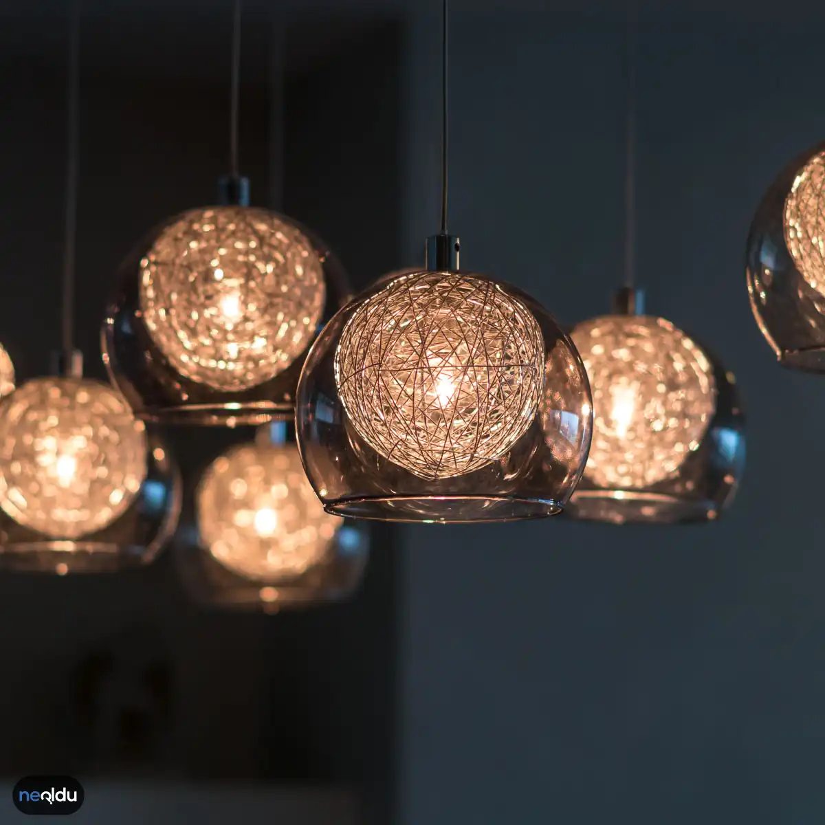
You want your living room and bedroom to feel like a hug after a long day. That’s where warm white and amber tones step in. They aren’t just colors; they are mood setters. Think of amber for that cozy, sunset vibe or warm white for a softer, more inviting glow.
But don’t sleep on daylight white for these spaces either. If you want the room to feel more alive, or if you need to see what you’re doing clearly without killing the vibe, daylight white works. It mimics natural light. It adds energy to a space that’s usually reserved for resting.
Kitchens and Dining Areas: Accuracy First
In the kitchen, you don’t want your chicken looking gray or your salad looking wilted. Cold white and daylight white are your go-tos here. Why? Because they render food colors accurately. You need to trust what you see when you’re cooking.
These cooler tones also make the space feel cleaner. Sterile, yes, but in a good way. It feels fresh. In the dining room, this clarity matters. You want your guests to look good in the photos, and you want the food to look appetizing, not dull.
Bathrooms and Toilets: Hygiene and Brightness
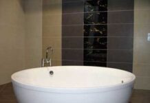
Bathrooms scream for daylight white and cold white. There’s a reason for this. It’s about hygiene. These light tones make the space feel brighter, sharper, and more sanitary. You’re dealing with water, soap, and bodily functions. You don’t want a warm, yellow cast hiding the grime. You want clarity. You want to see every spot so you can wipe it away.
Offices and Workspaces: Focus and Energy
If you’re working from home, your lighting dictates your output. Daylight white is the standard for a reason. It helps with color accuracy for documents and screens, reducing eye strain from trying to distinguish hues that are off.
More importantly, it keeps you zoned in. Cool light suppresses melatonin. It tells your brain it’s time to be alert. You want that energy spike when you’re tackling complex tasks or reading through dense reports.
Outdoor Spaces: Mirroring Nature
For patios, decks, and exterior lighting, daylight white is the king. It’s the closest match to natural sunlight. When the sun goes down, you don’t want your yard to look like it’s bathed in moonlight or a dim bulb. You want visibility. You want the activities to look natural and safe. It’s practical for security and usability alike.
Factors to Consider When Choosing Light Tone
Picking a bulb isn’t just about picking a color. It’s about the context of the room and how you use it.
- Functionality : Does the room require precision (kitchen/bath) or relaxation (bedroom)?
- Natural Light : How much sunlight hits the space during the day? A room full of windows might need warmer bulbs to balance the cool daylight streaming in.
- Mood vs. Utility : Are you trying to create a vibe or get work done?
- Color Rendering : For kitchens and art studios, high CRI (Color Rendering Index) bulbs are non-negotiable. You need to see true colors.
“Lighting sets the tone for the entire home. Get it wrong, and
Your home’s function dictates your lighting strategy. Stop guessing. Match the room’s purpose to the bulb’s output. A bedroom needs warmth. Use warm white here. It signals your brain to shut down. An office, however, demands focus. Go with daylight white. It mimics the sun. This keeps you alert during those long spreadsheets. The difference isn’t just aesthetic. It’s biological.
Matching Light to Decor
Your bulbs must respect your existing palette. Clashing tones create visual noise. If your walls lean earthy—think browns, tans, or warm woods—stick to warmer light. It deepens those tones. Cool spaces? You have grays, whites, and silvers. Pair them with cooler LED bulbs. The light should enhance the decor, not fight it. A mismatched bulb makes a good room look cheap.
The Hardware Matters
You are what you eat. Your lights are what they emit. Source changes everything. A standard halogen bulb tends toward warmth. It casts that yellowish glow. LED technology offers precision. You can buy LEDs labeled specifically for daylight. Check the box. Don’t assume. If you want that crisp, clinical office feel, you need the right diode. If you want cozy, you need a different circuit. The fixture is just the cage. The bulb is the soul.
“The wrong bulb kills the vibe before you even turn it on.”
Consider the materials in your space. Glass reflects. Wood absorbs. Metal glares. Your light source needs to account for these reactions. A warm bulb in a room full of steel might look sickly. A cool bulb in a room full of velvet might feel sterile. Test a sample bulb before wiring the whole house. It’s cheaper than rewiring later.