Your kitchen is the heart of the home. It’s the first thing guests see. It’s where you spend your actual time. So when the decor feels off, it sticks with you.
Some people lean neutral. Safe. Some go bold with moody cabinets, heavy hardware, or wild countertops.
But here’s the thing: going bold often tips over the edge into tacky. It’s not always about the individual pieces. It’s about the chaos that results when you pile too many trends into one square footage. Visual clutter kills elegance. Mismatched hardware? Tacky. Chaotic cabinet styles? Tacky.
We asked interior designer Brittny Button to help us spot the red flags. You want a timeless kitchen. You don’t want a showroom that looks like it gave up. Here is exactly where you are likely going wrong.
Зміст
Competing Colors Overpowering the Space
A colorful kitchen can look stunning. It can also look like a traffic accident.
The line between “bold” and “overwhelming” is razor thin. Brittny Button advises looking for complementary shades rather than competing ones. Think about what actually exists in nature.
Deep chocolate browns. Fawn. Taupe. Soft cream.
These tones work because they breathe together. They don’t fight for attention.
Button specifically warns against pairing two powerhouse shades. Do not put navy next to aubergine. Neither color will win. They will just overwhelm the space and make you tired just looking at it.
Pick one statement color. Then let the natural tones do the heavy lifting.
Chunky Transitions That Break the Flow
You are pulling together a color scheme. The goal isn’t just to have colors that match. The goal is seamlessness.
Look at the whole picture. Wall color. Cupboard finish. Hardware. Accent pieces.
Does it look cohesive? Does it feel timeless?
“If it feels off, and I’m questioning any color, then there is a disconnect that needs to be modified.” – Brittny Button
If you have to stop and stare to figure out why something feels weird, it is. Fix the disconnect before you add more layers. Don’t fill the space with decor items until you have your final vision locked in. Once you have visual chaos, it is nearly impossible to reverse.
Not Questioning Your Design Decisions
Trends are seductive. They look great the day you install them. They look dated three years later.
How do you avoid this trap? Use Button’s 3-2-1 rule.
Ask yourself these questions before you commit to anything:
- Will I still like this design in three years?
- Are there at least two complementary colors interacting well in the space?
- Is there one seamless visual note being conveyed?
If you answer “no” to any of these, pause. Adjust.
“It’s about the balance,” Button notes.
Poor Lighting Ruining the Vibe
You walk into a kitchen. It feels wrong. But you can’t put your finger on why. The cabinets are nice. The floor is good.
The culprit is probably the lights.
Most people underestimate their lighting plan. Your existing fixtures might not be doing the space any favors. According to Button, the biggest offender is drop ceiling lighting.
Why? It makes the ceiling feel closed in. It provides what she calls “yucky light.”
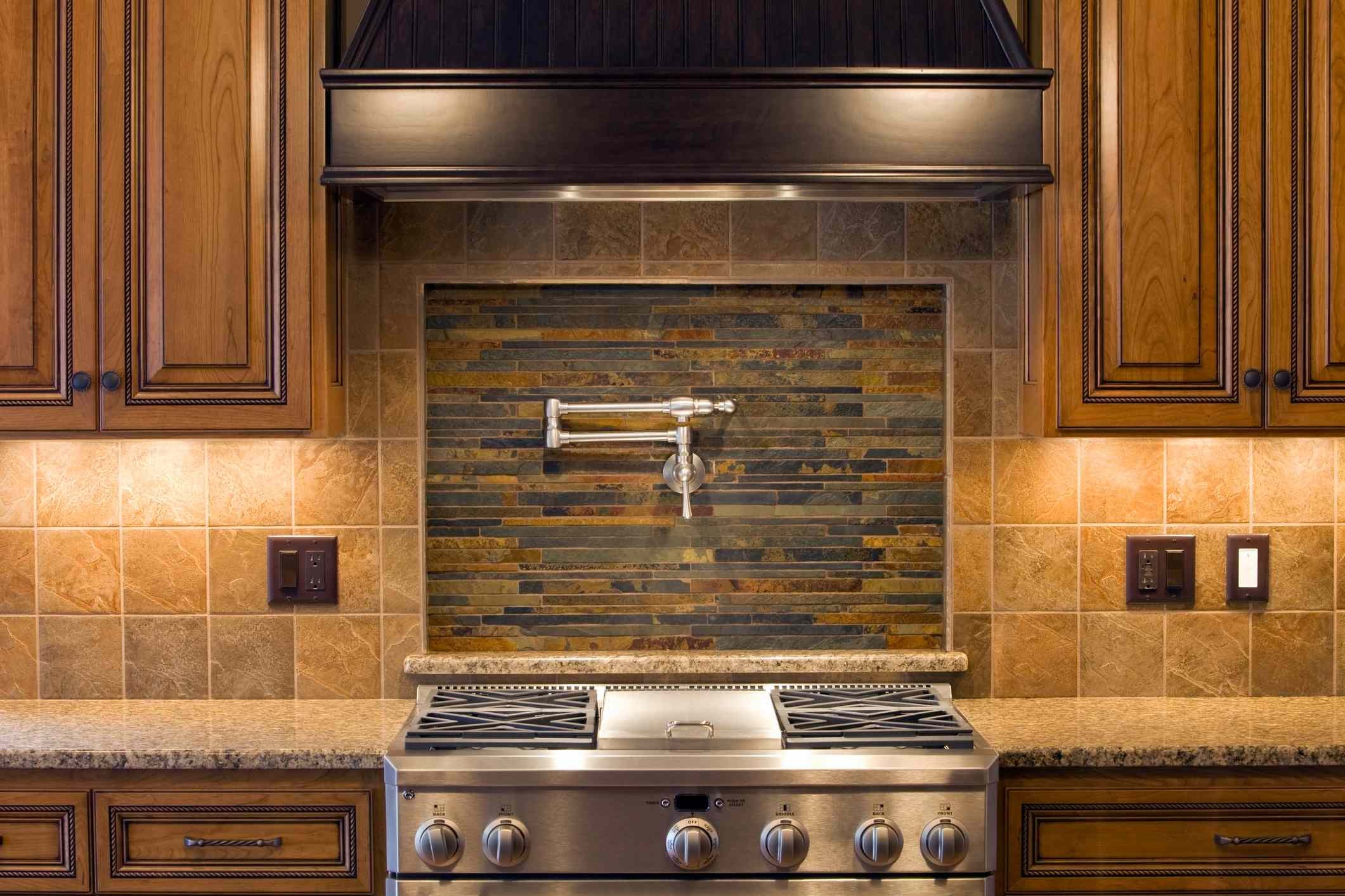
Switch it up. Under-cabinet task lighting can instantly transform how the room feels. It adds warmth. Pot lights are great for brightening dull corners, especially if you need clear light for a prep station.
Choosing the Wrong Materials for the Home
You don’t have to limit your material choices to the style of the house, but you shouldn’t ignore it entirely.
Some kitchens naturally lend themselves to certain materials. Others clash hard. Button points out that forcing a specific look into a home that doesn’t fit it makes the room look over-designed. Too complex.
Take exposed brick. It works wonders in a warehouse conversion. It feels industrial. Authentic.
Put that same brick in a farmhouse-style home? It feels out of place. It looks forced. Choose materials that respect the architecture of the home you’re in.
Not Prioritizing Flow
The kitchen is functional. Above all else, it is a workspace.
If the flow is bad, the design fails. The room becomes unpleasant. You trip over yourself. You can’t cook efficiently.
To fix this, follow the triangle rule.
Imagine a triangle connecting your fridge, stove, and sink. You want a clear path between them.
“Keep in mind, the ‘triangular shape’ can take many forms. Rather than just an equilateral, think isoscele, scalene, right angle.” – Brittny Button
The shape doesn’t have to be perfect. It just needs to allow for continuous movement. If you have to backtrack or squeeze past someone to get the milk, your triangle is off.
Decorative Signage That Screams Tacky
This one is hard for some. But Brittny Button is done with decorative signs.
As wall art in the kitchen? No.
“There never will be a classy one,” she says firmly. “Period.”
Stop putting them on the kitchen walls, the front porch, or the foyer. They convey a specific message: you’ve given up. You didn’t have the time or taste to curate real art.
While she is making that list, Button also wants us to ditch the faux plants. And the fake fruit. Real or nothing.
It’s not about having the most expensive items. It’s about intentionality. Your kitchen should feel like you, but refined. Not like a discount bin.